Saturday 31 October 2009
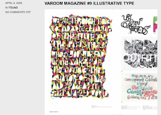
Natalia hand drawn type.
Here is some work by Natalia who has just graduated from the same course I am on. I really love the hand drawn type posters on her website. The compilation of different styles is something I am working on for the Headline brief.
Varoom issue 9, magazine.
From Varoom magazine.
The compilation of hand drawn type is what I am looking at in relation to my poster ideas for the Headline brief.
Friday 30 October 2009
Designs from Parra.
These designs relate to the sort of visuals I am looking to achieve for the Urban Outfitters Headline Screen print brief. The personality in the type really catches the audience's eye and is fun. Because of the headline I have chosen I want fun to also come across form my poster designs.
Wednesday 28 October 2009
 Angus Hyland and his team have redesigned the British men’s magazine Palladium. Launching with Issue 5, available this month, the revamp introduces a number of new design elements whilst retaining some of the recognisable, existing features. We have reinvigorated the overall identity by increasing the pace and rhythm of the layouts and adding stronger typography for the titles of key sections, interviews and fashion. The new design also makes greater use of the diagonal stripe that has always been a signature part of the magazine’s visual identity.
I am currently looking for ideas, and existing design work to help me desig my own spreads for the Anxiety UK brief where i have to create a self help handbook.
Just saw this and liked it, something different.
Its nice to still find things outside of my specialism that catches my eye, this piece of motion graphics is one of them...
Advertisement for the launch of the Turkish Edition of the New York Times, created by Istanbul-based studio Imago New Media
Advertisement for the launch of the Turkish Edition of the New York Times, created by Istanbul-based studio Imago New Media
Sunday 25 October 2009
More thing found no It's Nice That...


For the design practice module I am focusing on looking at existing design and designers that i want my work to go in the direction of, I find designs using geometry and illusions very inspirational and i hope the briefs that i have chosen will help me explore this type of visual further. The Anxiety UK will be a perfect brief to focus on the illusion side when creating geometric patterns. I can use these patterns as ideas for posters and the other materials i need to create.
Its nice that...
I love looking through design blogs! Here are various pieces of work i pulled from it's nice that
I like the layout of this piece, the monochrome is well balanced with bold headers and lighter bodies of text and image.
 This piece caught my eye because of the overlays used, combining the different letter forms and patterns creates an interesting visual piece. I am unsure whether i actually like it though. I like the idea but the use of colour is not to my taste:
 I have an interest in looking at letterpress so this was a nice little gem i found and read into:
 Nice typeface design use of tone has created a different typeface compared to what i have been seeing around recently:
 This was good to look at in relation to my phobias brief, I am currently creating wave patterns and optical illusions from them for a series of posters, Andreas' work definitely caught my eye impact-wise it is a very striking visual which is what i am aiming for with my poster designs:

I like the layout of this piece, the monochrome is well balanced with bold headers and lighter bodies of text and image.
 This piece caught my eye because of the overlays used, combining the different letter forms and patterns creates an interesting visual piece. I am unsure whether i actually like it though. I like the idea but the use of colour is not to my taste:
 I have an interest in looking at letterpress so this was a nice little gem i found and read into:
 Nice typeface design use of tone has created a different typeface compared to what i have been seeing around recently:
 This was good to look at in relation to my phobias brief, I am currently creating wave patterns and optical illusions from them for a series of posters, Andreas' work definitely caught my eye impact-wise it is a very striking visual which is what i am aiming for with my poster designs:
Poster designs...
Brochure designs - mainly covers
Just looking around for some quick inspriation for brochure covers.
Looking at the elements used on existing covers, sets off the overall design of the brochure.
From my crit the feedback i got on my anxiety uk brochure was to move away from the logo colours as it made it look too corporate and not very exciting. So i think i now need to look at more experimental cover designs.
These designs below are very formal so i need to move away from designs like these...


Thursday 1 October 2009
Joe Gilmore talk:
Joe Gilmore came into to chat to us today about his work, showed us the book he had been working on that is now on sale in amazon. Then i went on ffffound! last night and saw a post to do with the book! it is based on work created by artists who produce images from glitches.
I quite like this work because it has a geometric sort of feel, all the shapes creating the design but i like how they all have meaning behind them. Like one image can be created by turning a computer document into an image. Like the cover is made from the Indesign document opened as an image. I suppose i can even lean towards liking the abstract feel of it all too.
I found Joe's talk very informative and helpful as well as throwing in some inspiration in there too.
Grabbing a couple of tutorials with Joe will be great. :D

tad carpenter - the killers

I like//WHY?//
//Geometrical feel
// Limited colour palette
I must say i'm keen on the image side of the design but to be honest the typography is a bit lacking! lacking in what? well the same sort of feel as the images, its not really incorporated into the design very well and to me just feels like its stuck on, I think if i were to change the smallest of things it would be the white gap between the two words as it just doesnt link with the close knitt of the images.
Werkschau
Typeface design
Subscribe to:
Posts (Atom)


