Thursday, 29 April 2010


Wednesday, 28 April 2010
quick print guide...
| PSPRINT ONLINE PRINTING GUIDE |
CONTENTS
IntroductionDealing with colors
| Process colors (CMYK) Spot colors Halftones Duotones, Duographs, Tritones and Quadtones |
Paper considerations
| Paper color Paper type
Envelopes |
Printing Designs
| Bleeds Varnish Post-printing designs |
Printing Methods
| Offset printing Direct-to-plate printing Digital printing |
Printing Checklist
| Files Colors Paper information Other considerations |
Process Timeline
Conclusion
Online printing is a very convenient service that gives a low cost solution to everyone who needs to have their business cards, custom flyers, personalized posters, brochures and any other type of print done quickly and effectively. You simply upload your files through the Internet, make your paper, color and design choices, and have your printed materials delivered to your door.
Even if you do not have previous experience with online printing, getting your prints to look exactly the way you want is simple and intuitive. To make this process easier for you, we have developed this PsPrint Online Printing Guide.
This Guide aims to help you discover everything you need to ensure your print will be exactly what you want, in terms of colors, paper and all the different aspects that are vital for a top-quality, vivid “on-paper” version of your requirements.
We hope you enjoy reading this guide and find it clear, educative and, most of all, useful.
top
DEALING WITH COLORS
CMYK stands for Cyan, Magenta, Yellow and Black. These are the basic colors used in four-color process printing. They are combined to produce a wide range of final colors, and, believe it or not, these four colors can accurately represent high quality, colorful images and designs such as, for example, a vivid photograph.The way this combination works is very similar to the way an image is generated on your computer’s screen: each color is formed by mixing certain quantities of the basic colors. The main difference is that, for your PC’s monitor, the basic colors are RGB (Red-Green-Blue) instead of CMYK.
In order to effectively obtain the desired printing results, every image on your screen must be converted from the RGB color system to the CMYK color system before printing. This will ensure that the color combination will be the best possible, as the ink-mixing is calculated by your graphics software rather than the printer. RGB is less accurate than CMYK and doesn’t handle the heavy routines necessary to process and generate accurate conversions on the fly.
Sometimes you will need a specific color on your printing, not just an approximation. This is particularly true when you need to accurately reproduce a business logo or a representative image or design that needs to match other printed designs.
Selecting a specific color is a task that cannot be left “to the eye”, since the same color sometimes looks different on different screens, or under different light conditions. Besides, on-screen colors are made of RGB values, not CMYK. For this reason, a matching system is required to ensure that the printer will effectively produce the exact same color that the designer wants.
The most widely known and used system is the Pantone Matching System, or PMS. The Pantone color library is a big table containing thousands of colors, each one with a specific name.
Generally speaking, both spot color printing and CMYK printing have their own pros and cons. CMYK is a low cost solution to achieve a really wide range of colors, although many of those colors are just close approximations. In contrast, Spot colors give you the possibility to match a specific color exactly. However, the extra ink is an added cost and might not suitable for brochures, flyers or other prints that need to be produced at low-cost.
If you take a close look at a magazine, book or newspaper picture, you’ll see that it is made of tiny little dots of different colors, arranged so close together to give the feeling of more or less color strength. This is more noticeable on grayscale pictures, such as those on newspapers, in which the image is produced in several shades of gray despite that only black ink is used.


Halftones are useful to print color dithering, and to simulate shadows. Taking advantage of paper color, halftones are a great way to produce nice printing effects.
Duotones are halftone images made with two colors. Typically, one of the colors is black. By varying color intensities, the duotone image can be way better than a plain grayscale image. Similarly, Tritones and Quadtones are halftone representations using three and four colors respectively.
The general (and obvious) rule, the more colors in the halftone, the more realistic the printed image will be, but of course the more expensive too. If cost is an absolute priority, you can go with a Duograph (known as a “fake duotone”). A duograph is in fact a one-color halftone printed on top of a solid color background, in a way that simulates a true duotone. However, the image quality is highly inferior to that of a duotone.
If you are thinking of using a quadtone, you should consider a full CMYK printing, as it uses the same amount of colors (thus making the costs very similar) and allows for more accurate and defined images and designs.
top
PAPER CONSIDERATIONS
In addition to the amount of ink colors used, the color of the paper should be chosen carefully, as it can heavily change the way a completed project looks. If chosen correctly, the right paper color can allow a designer to “play” a little, producing great effects due to color contrast. However, a bad color paper choice may make the printing much less appealing to the eye.Most designers will choose white paper for their jobs, especially for projects involving photographs. This is because everything that is white on a design will end up being the same color of the chosen paper, which can severely affect the way a photograph looks.
A valid alternative is using a white paper with a very light background tint printed on it. This will allow you to visually simulate a colored paper while preserving the photograph’s white color. However, this may not be an option if you need a more professional finish, because the background will be made of tiny little dots, which will be evident in a close look.
Believe or not, even white paper is colored. They come with a subtle shade of another color. Thus, you may find gray-shaded white paper, cream, green, blue or even pink shaded white paper. This shades are so subtle that, if examined separately, all of those papers look all white; however you will see the differences if you put different white papers one next to each other for comparison.
If you are unsure of what paper color you should choose, here’s a quick way to find out: print your design on your regular printer (that is, your computer “normal” printer), on a transparent sheet. Take that transparency to your paper shop and place it over your possible paper choices, and see which color suits your project best. This, of course, will not look exactly the same as your professional finished printout, but it will help you get an approximate idea of how it will look.
Keep in mind that colored paper is usually a bit more expensive than white paper, so if you need a large amount of printing (flyers, for instance), this can represent a higher total cost.
There are a lot of possible paper choices, and this can be overwhelming, especially if you have no previous experience in professional printing. However, choosing the right paper is not so difficult: the most important thing to do is to consider what you are printing.
The main difference between coated and uncoated paper is that uncoated paper is more porous, and thus absorbs more ink, than coated paper. This means basically two things:
The results will be less accurate on an uncoated paper sheet, because the ink bleeds into the paper due to its absorption, blurring the printed halftone.
Coated paper tends to be more expensive, but makes printing jobs look more accurate and professional. Typically, coated paper is used to print business cards, brochures, postcards catalogs, and the like. There are many types of coating, depending on its brightness and texture. Matte, glossy and aqueous (water-resistant) are examples of coated paper.
Opacity
The term “opacity” refers to the ability of a paper to stop light from passing through. Simply put, a low opacity paper will let the reader see what is underneath, and a more opaque paper will prevent that from happening. Typically, newspapers, books and photographic projects that would look bad if the reader could see what’s under the print are printed on high-opacity papers. Low opacity (i.e. more transparent) paper can be used for fine wedding invitations or similar projects.
Thickness
Some projects, like postcards and business cards, will need to be printed on thick paper. Thick paper tends to be more resistant and heavier, and also more expensive. Books, magazines and similar projects that are printed on thick paper will seem to have more pages than they actually do. The right paper thickness depends on your specific project, but as a rule of thumb, postcards, cards and brochures will need paper that is thicker than that used for newspapers and flyers.
Although in some cases this may be not true, generally speaking the thickness of a paper is directly related to its weight. The weight of a paper is defined as the weight of 500 standard-sized sheets of paper, in pounds. The main aspect of the paper that directly influences its weight is its thickness; although it’s possible to find paper that is heavier than others while being less thick (i.e. coated paper is heavier than uncoated paper, so it’s possible to find uncoated paper sheets that are both thicker and less heavy than same-sized coated sheets.) Paper thickness is measured in points, and 12 pt. is considered very heavy cover stock.
Brightness
The brightness of a paper is a measure of how well it reflects ambient light. Coated paper is brighter than uncoated paper. The right brightness will help your printing seem more vivid, especially photographs. Except for flyers, newspapers and other projects that don’t require a very high quality, a bright paper is usually a good choice; beware, however, of choosing a paper that is too bright, because this may make reading difficult.
Strength
The stronger the paper, the more resistant and durable it is. The strength of a paper is and indication of its physical properties, such as elasticity and flexibility. Special projects that will require a strong kind of paper include paper bags and big posters.
Although paper sizes are standardized, with typical predefined sizes for business cards, postcards, brochures, books and more, there are differences depending on the standard you use. In the U.S., U.K. and Canada, the most common standard for paper sizes is the non-metric standard.
In this standard, paper sizes are measured in inches, with weight preceding height. Thus, “12x18” refers to a paper sheet that is 12 inches wide and 18 inches high. There are many other standards, so you should ask your printer which one they use, and their non-metric equivalent.
When choosing the size of the paper, you should consider minimizing paper waste. Sometimes is better to choose a bigger size if it let’s you accommodate more designs on the same sheet, cutting down paper waste and reducing the number of required printed sheets.

Envelope printing can be tricky, but once you got it right it will be really easy. The key is to choose an envelope size that is much bigger than what you need to print on it. This way, you can prevent errors and unexpected costs.
Envelopes come in a variety of sizes and shapes, being the most common:
Baronial: Used mostly for formal invitations, i.e. wedding invitations.
Booklet: These are used for mailing catalogs, folders, etc.
Commercial: These are the most common. They are used to send letters, documents and all kinds of everyday mailing.
Catalog: These envelopes are used for sending magazines, reports, catalogs and similar material.

top
PRINTING DESIGNS
Bleeds are objects that go beyond the defined paper limits for cutting. Suppose you are printing a brochure or any other project that requires an image to be placed in contact with the border of the document, then you will need to use bleeds. The process of cutting a sheet of paper may not be exact; many possible causes of error may cause your job to be trimmed the wrong way. Bleeds give some room for errors, preventing any inconvenience that an inaccurate trimming may cause.
Here is an image explaining bleeds.
Varnishing is a process that helps protect your final work by applying a protective layer above the already-printed job. Basically, it can be thought of as “non-colored ink”. Varnish makes your print brighter, and it’s better when applied on coated paper (because uncoated paper will absorb most of the varnish before it dries).
You should not use varnish on a paper that is already too bright, as the result may make it difficult for a person to read your page.
Depending on the nature of your online printing project, you may consider additional processing of your printouts, to make it look more professional and more useful.
You can do several things with your pages, depending on the intended use of your print job’s results:
Binding & Stitching: Booklets, calendars, notepads and similar projects will need to have all the pages joined together. This can be done by binding (a wire-spiral joins all the pages together) or by stitching (saddle-stitching is used mostly for booklets).
Perforation: Perforation consists on making holes on the paper, to allow people to separate it easily (usually by hand). This process is used mostly for tickets, as well as coupons. The holes are usually small, and can be round holes or have a dotted-line pattern.
Hole Drilling: This process is used for sheets that are intended to be stored into folders. Typically, hole drilling are used for personal planners’ and some calendar sheets.
Die Cut: Die-cutting is a process consisting in cutting a sheet of paper into a non-standard (i.e. non-rectangular) shape. Coloring books for children are typically die-cut. Many printers like PsPrint have readily available cutting dies that you can use; or you can make your own custom one for an additional price.
Scoring & Folding: This process is usually applied to postcards and similar projects, allowing them to be folder without forming unsightly creases.
Numbering & Secure Foil: This process consists on applying a hologram or another design on the printout, as well as assigning a unique number to each sheet. This is useful to make each ticket unique and to prevent it from being copies. Secure foil and numbering is used for concert or event tickets.
top
ONLINE PRINTING METHODS
Depending on your desired printing quality, there are many possible choices when it comes to printing methods. Each one has its advantages and disadvantages, and of course each one may suit a different budget.Offset printing is a technique in which the actual printing is made by a rubber blanket. This blanket has been transferred the printing image from a plate, and then is used to actually “stamp” the ink on the paper. An image setter is used to make the film that will be used to generate the metal printing plate.
It is usually combined with lithography, a process that consists on chemically treat the metal plates to accept oil while reject water, relying on the principle that water and oil don’t mix. Ink sticks to the plate where needed, and then the ink pattern is transferred to the rubber blanket.
This offset lithography printing method produces high quality printing and less deformation, because the rubber blanket adapts itself to the texture of the paper. This printing method also preserves the plates from damage, because they don’t come in direct contact with the paper surface. Offset printing is ideal for high volume printing jobs that require a good quality.
The direct-to-plate printing method is similar to the offset method, except for one thing: the metal plates are made directly from a computer file rather than from film, which cuts down costs. The disadvantage is that, as there is no film involved, there’s no possibility to make a color correct proof before making the plate. Instead, you can get a digital color proof, which is less costly but also less accurate than a film color proof.
The elimination of the film-creation step effectively reduces costs, so direct-to-plate printing is a much recommended choice for those projects that don’t rely on exact color matching.
Digital printing is, in fact, a fancy form of color photocopying. It doesn’t vary too much from the regular printing that anyone can do in their home with their computers and an inkjet printer. Although, of course, the actual printer used is a bit more powerful and professional than a home, regular one.
In this method, the image is sent directly to the printer: no film, no plates. For low-quantity printings, this is the most cost-effective solution, although for bigger bulks offset or direct-to-plate should be used.
Although substantially cheaper, digital printing can only work with CMYK colors (i.e. no Pantone or other spot colors), and thus it may not be ideal for certain projects.
Before deciding on which method to use, you should ask your printer what options they offer, and also what is the minimum quantity. It’s not uncommon to find that a supposedly cheaper method is indeed more expensive for larger jobs.
top
PRINTING CHECKLIST
With a working knowledge of how online printing works, you are now ready to you’re your designs to your printer. Before you submit your project, however, you should go through this checklist. If you miss one of these items, you may get undesired delays, or even end up with completely unusable printed pages.Carefully check the files you will need to send the printer. Be sure no file is missing, and remember that you will need to convert your files to CMYK color format, as it’s possible that they are in RGB. Double or triple check everything before submitting, or you may regret it later.
Check your designs for special colors that CMYK might not reproduce. These spot colors might have to be added on top of the four main colors for extra cost. If possible, try replacing it with a shade that CMYK can replicate.
Be sure to specify the exact paper you need your prints on. If you use a colored paper, provide the exact color code to your printer, not just a descriptive name. Also, remember to tell the right paper weight and thickness, opacity and type of paper to your printer, to avoid any possible confusion. Don’t let them decide on any particular subject, instead, supply them with complete and accurate information.
The size of the paper is also a major consideration; make sure you know which standard they use for measuring paper sizes (i.e. non-metric vs. ISO), and supply them with the correct information.
If your project will require special post-print designs like drilled holes, die-cutting or perforation, be sure you are concise and clear when explaining this to your printing company.
Make sure you clearly understand the pricing scheme, according to the quantity of prints you need. Also, be sure that you have a clear understanding of the timing involved (time before color proof, time of actual delivery time, etc.)
top
The typical printing process is rather simple. It involves a few steps that are necessary to ensure the best possible results. The process can be summarized like this:
Submit designs: The first step, of course, is for you to reach an agreement with your printer and send them all your files and requirements, so they can start working.
Printer develops proof: Within a day, the printing company will be ready to make a proof-print. Luckily, this will be similar to how the completed project will look. They may check that proof themselves for any mistake they may have made, and reprint it if they find something that is their fault.
Printer sends proof: After 2 to 3 days, the printer will send the proof for you to check everything is correct. You should check it thoroughly, as once you approve it, the file becomes final. Check for color exactitude (if you chose to use spot colors), and make sure there are no typos.
After proofing: If you find that everything is in order, then you will contact the printer and tell them to proceed with the work. If you are not happy with the proof, make the necessary changes and re-submit it to the printer. Start over from step b) until everything is perfect.
Printing: After approval, your printer will start the actual printing process. Depending on the quality of service and the type of project, it may take up to 10 days for the printing to be completed.
Shipping: The printer will ship the completed job to you. Shipping costs will depend on the shipping method used, the weight of the final job, and the cost of the actual printing (usually printers offer discounts on shipping for large projects).
Receiving the printouts: After these steps are completed, you will receive the finished job. If you need to receive the results quicker, it may be possible to ask for express printing, which will allow you to get your prints within a week, but at an additional cost, or premium.
top
As you can see, getting the right online printing results is easy. Having your dream designs printed on paper is easy, may be much less expensive than you may think, help you deliver your message, and you will be pleasantly surprised.
The graphics company.


The Graphics Company
specialises in print and web design for charities, social enterprises and public sector organisations across Scotland. I picked out a few of the projects that interested me the most, mainly because of the aesthetic and typography and layout. The format for the collection box intregued me I never thought about someone sitting down and designing those before, how do you grab a persons attention for that split second enough for them to put their hand in their pocket and part with some cash. Consumer psychology seems to play a big part in charity design work.
specialises in print and web design for charities, social enterprises and public sector organisations across Scotland. I picked out a few of the projects that interested me the most, mainly because of the aesthetic and typography and layout. The format for the collection box intregued me I never thought about someone sitting down and designing those before, how do you grab a persons attention for that split second enough for them to put their hand in their pocket and part with some cash. Consumer psychology seems to play a big part in charity design work.
Waiting for permission...
Waiting for Permission
It almost seems like a dream now. Big budgets. Fat, happy suggestible clients cruising happily along, with fat, happy design firms feeding greedily in their wake. Lavish corporate identity manuals. Hardcover brochures promoting office space in shiny buildings by brand name architects. Annual reports for non-profit clients-non-profit!-with a little picture on the cover, a flyleaf with nothing printed on it, then another page, new paper stock, with just one or two words in 8 point type, then another page, another paper stock-with nothing on it- then a piece of coated paper with another little picture on it, and then-maybe-the darned thing would finally start, after the atmosphere had been properly created.... The eighties seem far away now, so far away, so much farther than the calendar tells us. To young designers entering the field in the lean and mean nineties, the previous decade will surely seem like an impossibly golden age, one of almost unimaginable excess and bravura. Even to those of us who lived through it, it takes the incontrovertible evidence of a flashy portfolio piece-circa, say, 1986-to remind us how much things have changed.
And they have changed. This decade sees a new awareness of environmental issues, much of it lip service abounding with soy-based images of squirrels and pine cones, but for the most part deeply felt. It doesn’t necessarily mean that graphic designers have ceased to trade in excess for its own sake, but the examples of that excess are just as likely to provoke embarrassment as envy.
This decade also sees among designers a new social consciousness as well, one provoked by equal parts Clarence Thomas and Daryl Gates. The voice this consciousness takes is sometimes cracked and halting (perhaps due to years of disuse) but genuine nonetheless.
Ten years ago, it seemed as though a typical pro-bono piece was a lavish six-color production of a clever visual pun: today it’s just as likely to be something down-and-dirty that as least looks as though it was designed to truly help the client’s cause rather than add awards to the designer’s trophy cases.
All in all, designers in the nineties seem to want more than ever to create work that’s appropriate, that’s relevant, that challenges the client’s brief, that’s aimed at more than the next design competition. In short, the spirit is willing.
But the flesh, for the most part, remains weak. While these issues dominate designer’s consciences, they still remain peripheral to most of our practices. Designers continue to work dutifully (probably, in fact, more urgently than ever these days),wishing that they could do what they think is right, rather than what they’re told to do, all in the name if “professionalism.” The fundamental idea of truly challenging the client’s expectations, of getting outside the grinding process of filling the orders and shipping the goods, of “being bad,” (as Tibor Kalman exhorted us at the 1989 American Institute if Graphic Arts Conference in San Antonio) still seems an elusive goal for most designers.
Is it hard to see why? As Milton Glaser said at that same conference, “Friends are friends, but a guy’s gotta eat.” Most of us would say that our ideals, whether newfound or long held, give away at the end of the day to the pressures of running our businesses, that the sanest course of action is to push environmental activism or social consciousness as far as you can and then back off to fight another day, that a client’s a client and an invoice is an invoice. In the end it’s all about money, isn’t it?
Well, maybe not. Maybe it’s about something else, something that hasn’t changes, something to do not with money but with very structure of the relationship between designers and their clients.
Most relationships in daily life are defined at least in part, by hierarchy. Someone is in charge, and someone is following orders. Often these relationship are immutable: parent and child, student and teacher, employee and employer. Occasionally the roles are more interchangeable, as in the case of marriages or partnerships.
If you believe what you read in most designer’s promotional literature, that’s what the designer-client relationship is meant to be: a partnership. Sometimes even clients themselves (at least new clients) enthuse about this idea as well. But privately, most designers would concede that most of their client relationships are anything but partnerships, a fact that’s seen as both frustrating and basically unchangeable.
In the early sixties, a psychologist at Yale University named Stanley Milgram did a series of notorious experiments that explored the dynamics of hierarchical relationships, ones where someone was in charge and someone else was following orders. He wanted to fins out how far someone would follow the orders of another person if he perceived that person’s authority as legitimate.
The experiments had many variations, but they all basically went like this. Milgram asked people to volunteer for an experiment they were told was about the relationship of learning and punishment. The volunteers, who came from all walks of life, were each paid $4.50 and were shown the same setup when they arrived in Milgram’s lab.
They were introduced to another person they were told was a fellow volunteer. The second person was to serve as the “learner” and the subject was to act as “teacher.” The teacher would be directed by the experimenter to read a series of word pairs to the learner, and then test the learner on his memory. For each answer the learner got wrong, the teacher was to administer to him an electric shock. This was done with a control panel with thirty switches ranging from 15 to 450 volts, labeled in increments “slight shock,” “moderate shock,” “strong shock,” and on up to “extreme intensity shock,” “danger: severe shock,” and finally the cryptic and presumably frightening label “XXX.” For each wrong answer, the volunteer teacher was to increase the shock level by one notch.
Of course, the whole setup was an illusion. The shock panel was a convincing-looking but harmless prop; the fellow volunteer, the “learner,” was an employee of Milgram’s who was particularly good at screaming in agony when receiving the imaginary shocks. The purpose of the exercise was not to study learning, but to study obedience: Milgram wanted to find out how far people would go up the scale, how much pain they would inflict on a fellow human being, just because someone else told them to.
Before he began, Milgram asked his students and fellow psychologists to predict how many people would administer the highest shock. The answers were always the same: at the most, one or two out the hundred. Milgram himself, then, was surprised when almost two-thirds, 64% of the subjects, did and they were told and went all the way to the top of the scale.
Milgram did a lot of variations in the experiment to try to drive the number down. He moved the setting from Yale to tawdry-looking storefront; he had the learner complain of a possibly fatal heart conditions; he fixed it so the subject actually had to hold the learner’s hand down on a “shock plate.” None of it made much difference. No matter what, about half of the volunteers administered all the shocks to the helpless learner.
These experiments are fairly well known to the general public, and the most common moral drawn from them is something like, “People are capable of anything if they’re given an excuse to do it.” However, this is a misinterpretation: most of the subjects, even the fully obedient ones, were anything but cheerful as they followed the experimenter’s commands. In fact, it was common for subjects to protest, weep, or beg to break off the experiment. Still, the obedient majority, prodded calmly by the experimenter, would pull themselves together, do what had to be done, and administer the shocks.
Of course, designers are regularly paid a lot more than $4.50 to do things a lot less overtly heinous than administering a 450 volt-volt shock to a fellow human being. Occasionally they help promote a cause or product they truly don’t believe in or design something to intentionally deceive the public. But these dilemmas are fairly rare.
Most commonly, what most of us have done at one time or another is make something a little stupider or a little uglier than we really thought it ought to be. We’ve had good reasons: we need the money, we need the experience, we don’t want to jeopardized the relationship, we know it’s wrong, we have no choice. This would sound familiar to Dr. Milgram. “Some subjects were totally convinced of the wrongness of what they were doing” he observed, “but could not bring themselves to make an open break with authority. Some derived satisfaction from their thoughts and felt that -within themselves, at least- they had been on the side of the angels. What they had failed to realize is that subjective feelings are largely irrelevant to the moral issue at hand so long as they were not transformed into action.” We too somehow remain on the side on the angels.
So is it all about money? Probably not. The subjects in Milgram’s experiments often wanted desperately to quit, but they couldn’t just get up and walk away. What kept them at the shock panel wasn’t the $4.50 they were being paid but their idea that the experimenter, and not they, and certainly not the helpless subject at receiving end of the wire, was in charge. Designers, even in a climate that finds us more and more driven to question the social and ethical underpinnings of our work, cede the same authority to our clients.
Most of us enter the field of design filled with individual passions and unrealized visions, and learn quickly that the other people know better: first teachers, then bosses, finally even the judges of design competitions and editors of design annuals. We put aside our doubts-none of us want to be prima donnas anyway-and become comfortable professionals in just another service industry. And when we’re roused to out feet by a call to action, second thoughts set in. “That’s easy for him (Tibor, Milton, fill in the blank) to say. “but my clients won’t let me do that.” But of course that’s not true. In fact, we don’t know what would happen of we tried: we take too much pride in the quality of our “service” to find out. So business as usual remains business as usual.
Who’s in charge here, anyway?
The designer-client relationship can and should be a partnership. It’s time to stop blaming the client when it’s not. Our work can and should serve society: it should serve an audience beyond ourselves, beyond our clients, and beyond the next design annual. Otherwise, the member of that audience, the users of the products and messages that we produce, will remain wired to their seats, awaiting the next shock.
And we designers, wanting to do what’s right but afraid to make trouble, will keep sitting, maybe just a little more nervously, our fingers on our control panels, waiting for permission.
Waiting for Permission by Michael Bierut
And they have changed. This decade sees a new awareness of environmental issues, much of it lip service abounding with soy-based images of squirrels and pine cones, but for the most part deeply felt. It doesn’t necessarily mean that graphic designers have ceased to trade in excess for its own sake, but the examples of that excess are just as likely to provoke embarrassment as envy.
This decade also sees among designers a new social consciousness as well, one provoked by equal parts Clarence Thomas and Daryl Gates. The voice this consciousness takes is sometimes cracked and halting (perhaps due to years of disuse) but genuine nonetheless.
Ten years ago, it seemed as though a typical pro-bono piece was a lavish six-color production of a clever visual pun: today it’s just as likely to be something down-and-dirty that as least looks as though it was designed to truly help the client’s cause rather than add awards to the designer’s trophy cases.
All in all, designers in the nineties seem to want more than ever to create work that’s appropriate, that’s relevant, that challenges the client’s brief, that’s aimed at more than the next design competition. In short, the spirit is willing.
But the flesh, for the most part, remains weak. While these issues dominate designer’s consciences, they still remain peripheral to most of our practices. Designers continue to work dutifully (probably, in fact, more urgently than ever these days),wishing that they could do what they think is right, rather than what they’re told to do, all in the name if “professionalism.” The fundamental idea of truly challenging the client’s expectations, of getting outside the grinding process of filling the orders and shipping the goods, of “being bad,” (as Tibor Kalman exhorted us at the 1989 American Institute if Graphic Arts Conference in San Antonio) still seems an elusive goal for most designers.
Is it hard to see why? As Milton Glaser said at that same conference, “Friends are friends, but a guy’s gotta eat.” Most of us would say that our ideals, whether newfound or long held, give away at the end of the day to the pressures of running our businesses, that the sanest course of action is to push environmental activism or social consciousness as far as you can and then back off to fight another day, that a client’s a client and an invoice is an invoice. In the end it’s all about money, isn’t it?
Well, maybe not. Maybe it’s about something else, something that hasn’t changes, something to do not with money but with very structure of the relationship between designers and their clients.
Most relationships in daily life are defined at least in part, by hierarchy. Someone is in charge, and someone is following orders. Often these relationship are immutable: parent and child, student and teacher, employee and employer. Occasionally the roles are more interchangeable, as in the case of marriages or partnerships.
If you believe what you read in most designer’s promotional literature, that’s what the designer-client relationship is meant to be: a partnership. Sometimes even clients themselves (at least new clients) enthuse about this idea as well. But privately, most designers would concede that most of their client relationships are anything but partnerships, a fact that’s seen as both frustrating and basically unchangeable.
In the early sixties, a psychologist at Yale University named Stanley Milgram did a series of notorious experiments that explored the dynamics of hierarchical relationships, ones where someone was in charge and someone else was following orders. He wanted to fins out how far someone would follow the orders of another person if he perceived that person’s authority as legitimate.
The experiments had many variations, but they all basically went like this. Milgram asked people to volunteer for an experiment they were told was about the relationship of learning and punishment. The volunteers, who came from all walks of life, were each paid $4.50 and were shown the same setup when they arrived in Milgram’s lab.
They were introduced to another person they were told was a fellow volunteer. The second person was to serve as the “learner” and the subject was to act as “teacher.” The teacher would be directed by the experimenter to read a series of word pairs to the learner, and then test the learner on his memory. For each answer the learner got wrong, the teacher was to administer to him an electric shock. This was done with a control panel with thirty switches ranging from 15 to 450 volts, labeled in increments “slight shock,” “moderate shock,” “strong shock,” and on up to “extreme intensity shock,” “danger: severe shock,” and finally the cryptic and presumably frightening label “XXX.” For each wrong answer, the volunteer teacher was to increase the shock level by one notch.
Of course, the whole setup was an illusion. The shock panel was a convincing-looking but harmless prop; the fellow volunteer, the “learner,” was an employee of Milgram’s who was particularly good at screaming in agony when receiving the imaginary shocks. The purpose of the exercise was not to study learning, but to study obedience: Milgram wanted to find out how far people would go up the scale, how much pain they would inflict on a fellow human being, just because someone else told them to.
Before he began, Milgram asked his students and fellow psychologists to predict how many people would administer the highest shock. The answers were always the same: at the most, one or two out the hundred. Milgram himself, then, was surprised when almost two-thirds, 64% of the subjects, did and they were told and went all the way to the top of the scale.
Milgram did a lot of variations in the experiment to try to drive the number down. He moved the setting from Yale to tawdry-looking storefront; he had the learner complain of a possibly fatal heart conditions; he fixed it so the subject actually had to hold the learner’s hand down on a “shock plate.” None of it made much difference. No matter what, about half of the volunteers administered all the shocks to the helpless learner.
These experiments are fairly well known to the general public, and the most common moral drawn from them is something like, “People are capable of anything if they’re given an excuse to do it.” However, this is a misinterpretation: most of the subjects, even the fully obedient ones, were anything but cheerful as they followed the experimenter’s commands. In fact, it was common for subjects to protest, weep, or beg to break off the experiment. Still, the obedient majority, prodded calmly by the experimenter, would pull themselves together, do what had to be done, and administer the shocks.
Of course, designers are regularly paid a lot more than $4.50 to do things a lot less overtly heinous than administering a 450 volt-volt shock to a fellow human being. Occasionally they help promote a cause or product they truly don’t believe in or design something to intentionally deceive the public. But these dilemmas are fairly rare.
Most commonly, what most of us have done at one time or another is make something a little stupider or a little uglier than we really thought it ought to be. We’ve had good reasons: we need the money, we need the experience, we don’t want to jeopardized the relationship, we know it’s wrong, we have no choice. This would sound familiar to Dr. Milgram. “Some subjects were totally convinced of the wrongness of what they were doing” he observed, “but could not bring themselves to make an open break with authority. Some derived satisfaction from their thoughts and felt that -within themselves, at least- they had been on the side of the angels. What they had failed to realize is that subjective feelings are largely irrelevant to the moral issue at hand so long as they were not transformed into action.” We too somehow remain on the side on the angels.
So is it all about money? Probably not. The subjects in Milgram’s experiments often wanted desperately to quit, but they couldn’t just get up and walk away. What kept them at the shock panel wasn’t the $4.50 they were being paid but their idea that the experimenter, and not they, and certainly not the helpless subject at receiving end of the wire, was in charge. Designers, even in a climate that finds us more and more driven to question the social and ethical underpinnings of our work, cede the same authority to our clients.
Most of us enter the field of design filled with individual passions and unrealized visions, and learn quickly that the other people know better: first teachers, then bosses, finally even the judges of design competitions and editors of design annuals. We put aside our doubts-none of us want to be prima donnas anyway-and become comfortable professionals in just another service industry. And when we’re roused to out feet by a call to action, second thoughts set in. “That’s easy for him (Tibor, Milton, fill in the blank) to say. “but my clients won’t let me do that.” But of course that’s not true. In fact, we don’t know what would happen of we tried: we take too much pride in the quality of our “service” to find out. So business as usual remains business as usual.
Who’s in charge here, anyway?
The designer-client relationship can and should be a partnership. It’s time to stop blaming the client when it’s not. Our work can and should serve society: it should serve an audience beyond ourselves, beyond our clients, and beyond the next design annual. Otherwise, the member of that audience, the users of the products and messages that we produce, will remain wired to their seats, awaiting the next shock.
And we designers, wanting to do what’s right but afraid to make trouble, will keep sitting, maybe just a little more nervously, our fingers on our control panels, waiting for permission.

Good

Blog for all design that is considered good, features lots of design that deals with issues I am interested in within respects of social issues dealt with by graphic design.


First things first...
First Things First 2000
a design manifesto
manifesto published jointly by 33 signatories in:
Adbusters, the AIGA journal, Blueprint, Emigre, Eye, Form, Items
fall 1999 / spring 2000
foreword
by Chris Dixon, Adbusters
introduction
by Rick Poynor
We, the undersigned, are graphic designers, art directors and visual communicators who have been raised in a world in which the techniques and apparatus of advertising have persistently been presented to us as the most lucrative, effective and desirable use of our talents. Many design teachers and mentors promote this belief; the market rewards it; a tide of books and publications reinforces it.
Encouraged in this direction, designers then apply their skill and imagination to sell dog biscuits, designer coffee, diamonds, detergents, hair gel, cigarettes, credit cards, sneakers, butt toners, light beer and heavy-duty recreational vehicles. Commercial work has always paid the bills, but many graphic designers have now let it become, in large measure, what graphic designers do. This, in turn, is how the world perceives design. The profession's time and energy is used up manufacturing demand for things that are inessential at best.
Many of us have grown increasingly uncomfortable with this view of design. Designers who devote their efforts primarily to advertising, marketing and brand development are supporting, and implicitly endorsing, a mental environment so saturated with commercial messages that it is changing the very way citizen-consumers speak, think, feel, respond and interact. To some extent we are all helping draft a reductive and immeasurably harmful code of public discourse.
There are pursuits more worthy of our problem-solving skills. Unprecedented environmental, social and cultural crises demand our attention. Many cultural interventions, social marketing campaigns, books, magazines, exhibitions, educational tools, television programs, films, charitable causes and other information design projects urgently require our expertise and help.
We propose a reversal of priorities in favor of more useful, lasting and democratic forms of communication - a mindshift away from product marketing and toward the exploration and production of a new kind of meaning. The scope of debate is shrinking; it must expand. Consumerism is running uncontested; it must be challenged by other perspectives expressed, in part, through the visual languages and resources of design.
In 1964, 22 visual communicators signed the original call for our skills to be put to worthwhile use. With the explosive growth of global commercial culture, their message has only grown more urgent. Today, we renew their manifesto in expectation that no more decades will pass before it is taken to heart.
signed:
Jonathan Barnbrook
Nick Bell
Andrew Blauvelt
Hans Bockting
Irma Boom
Sheila Levrant de Bretteville
Max Bruinsma
Siân Cook
Linda van Deursen
Chris Dixon
William Drenttel
Gert Dumbar
Simon Esterson
Vince Frost
Ken Garland
Milton Glaser
Jessica Helfand
Steven Heller
Andrew Howard
Tibor Kalman
Jeffery Keedy
Zuzana Licko
Ellen Lupton
Katherine McCoy
Armand Mevis
J. Abbott Miller
Rick Poynor
Lucienne Roberts
Erik Spiekermann
Jan van Toorn
Teal Triggs
Rudy VanderLans
Bob Wilkinson
and many more
original Manifesto, 1964
reaction
by Jouke Kleerebezem
disciussion
Info Design Cafe mailinglist
miscellaneous reactions
Budget Budget Budget.
More info on design budgets.
When working as a graphic designer, you will inevitably come across clients with limited budgets. In some cases, this may mean you need to decline the job. However, other projects have benefits beyond pay, and you will find yourself looking for ways to work within the client’s budget. There are several reasons you may want to do so, and several ways to make it less likely to regret your decision.
[Source: http://graphicdesign.about.com/od/workingwithclients/qt/limited_budget.htm]
When working as a graphic designer, you will inevitably come across clients with limited budgets. In some cases, this may mean you need to decline the job. However, other projects have benefits beyond pay, and you will find yourself looking for ways to work within the client’s budget. There are several reasons you may want to do so, and several ways to make it less likely to regret your decision.
Reasons to Work for Less
Deciding whether or not to work for less than you think a job is worth is of course a personal decision. In some cases, it may be worth working within a client’s limited budget if the project can lead to more work, making it an initial sacrifice with potential long-term returns. The job may also be a nice piece for your portfolio, you may have open time in your schedule and looking for work, or looking to break into a new industry. Depending on the reason, you may wish to take on the project as you would any other, or adjust some policies or methods in order to compensate for the lower pay.Limit the Scope of the Work
One of the easiest ways to work within a limited budget is to limit the scope of the work, and therefore the time invested in the project. Let the client know what you can for the amount of money they can spend, allowing them to still obtain your quality of work while shrinking the size of the project. For a website design, this could mean holding off on some features or pages until more money is available in the budget. For a logo design or print project, it could be providing less initial concepts to work from than usual. For example, if you normally start with three designs to choose from, limit it to two with additional work billed separately. Cutting the number of pages in a book or brochure can lower your time and the amount invested in printing costs, as can choosing different paper to work with. Any one of these options can allow you to lower the budget while still providing a quality product to your client.Creative Freedom
A designer may also choose to work for less for creative freedom in a project. In some cases, designers get their start even working for free for complete creative freedom, meaning they have final say in the look and feel of the work. Such decisions should be discussed with clients and spelled out in contracts, like any other elements of the agreement.[Source: http://graphicdesign.about.com/od/workingwithclients/qt/limited_budget.htm]
Design for print on a budget
As the sectors I am interested in designing for have varied budgets and quite often small budgets I have researched further into other designers thoughts on design tips for budgets and process etc that can be achieved for print based designs.


Context publication. Title and contents.
Title and contents revised after the crit. Need to focus more on the content within the interviews / case studies of each design studio. What makes the information I have collected important to me? The focus of the book is to show all things considered when designing type and layout for social, health and educational issues.
This focuses on clients, brand guidelines, budgets, format and process, successful and not so successful ways to approach briefs for social, health and educational issues.
Title:
All Things Considered: type and layout for social, health and educational issues.
Contents:
1. Introduction / About
2. Public & Private sector design.
3. Rare
4. Raw
5. Eleven
6. Case study 4
7. Case study 5
8. Evaluation
I'm going to now spend some time looking at my content and see if I can refine my contents page a bit more.
Tuesday, 27 April 2010


Ali - photograph and type graphics
Saw these on Ollie's blog ages ago and they fit really well as research for the current designs I have done for the Greenpeace campaign on nuclear power.


leaflet formats
leaflet formats, very handy when considering different angles to approach design problems.


Thursday, 22 April 2010
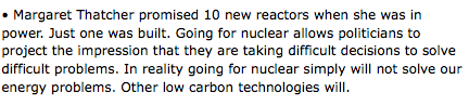
Greenpeace - on nuclear power
I am currently working on a brief based on nuclear power for Greenpeace, so what better research than looking at their view on the matter in more detail. All below is from their UK website.
www.greenpeace.org.uk


www.greenpeace.org.uk


Tuesday, 20 April 2010
cartlidge levene
Really liking the bold type and layout used within Cartlidge Levene's design work. They have a good balance when showing colour and type together which I still struggle with sometimes as it can effect legibility of the words within layout.


Contacts ... an update.
Throughout my research I have developed a substantial mailing list. I have taken this and emailed requests to send design studios and designers asking if I could steal some of their time to answer a few questions. I have now received a few initial replies and full answers to my questions from Raw design and Eleven design.
I am over whelmed by how generous and supportive people have been with this project and the answers I have received are insightful and very useful as I have even been directed to further websites and sources that can aid my research further for my design context. Its really nice to receive information about projects I have admired from different studios and also valuable advice they have given me.
I chose not to post the interviews on my blog as I haven't asked permission to do so from the studios, as a personal project to me I benefit the most from the answers anyway so I guess it doesn't really matter much.
Lulu
Lulu was mentioned to us in a previous briefing for design context as a place to get short run publications printed. As I am interested in designing a publication for my context I had a quick look at the site and how I had to go about setting up an order and the options that would be available to me, e.g paper size binding techniques and importantly price. As a starting point this site is very useful.


Subscribe to:
Posts (Atom)