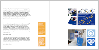
I Think this spread is coming on nicely, I like the idea of colour coding my own analysis in boxes that link to the chapter heading page colour. I think the spread works quite well considering the images have to stay relatively small as I could only get hold of 72dpi versions. I did ask the relevant studios if they could send me higher resolutions but it is understandable why they didn't.
Monday, 3 May 2010
Subscribe to:
Post Comments (Atom)


No comments:
Post a Comment